A custom brand–typeface for a creative agency
project_
Custom Typeface
client_
Mixed Media Creations
role_
Type Design
Font Creation
Brand Identity
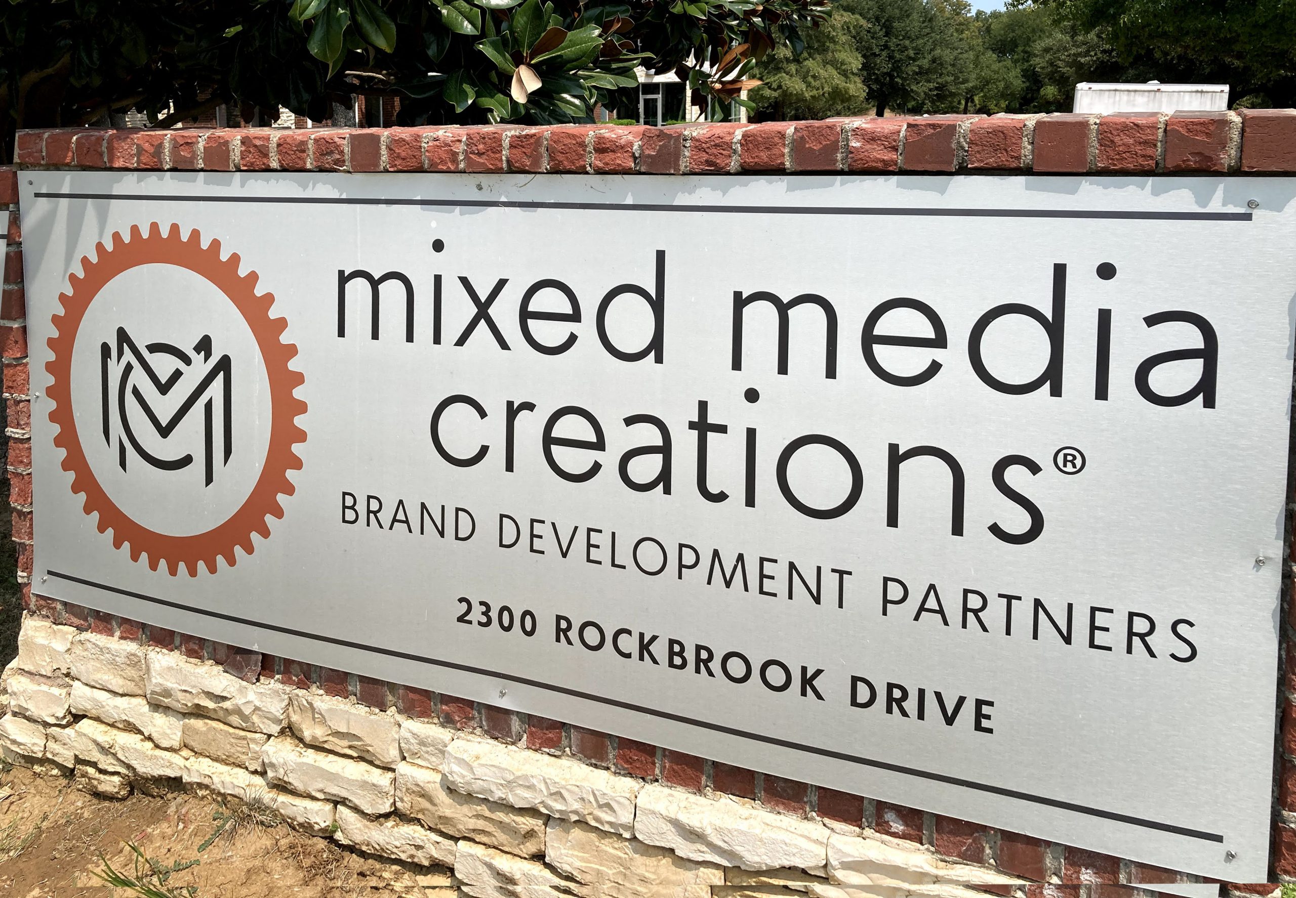
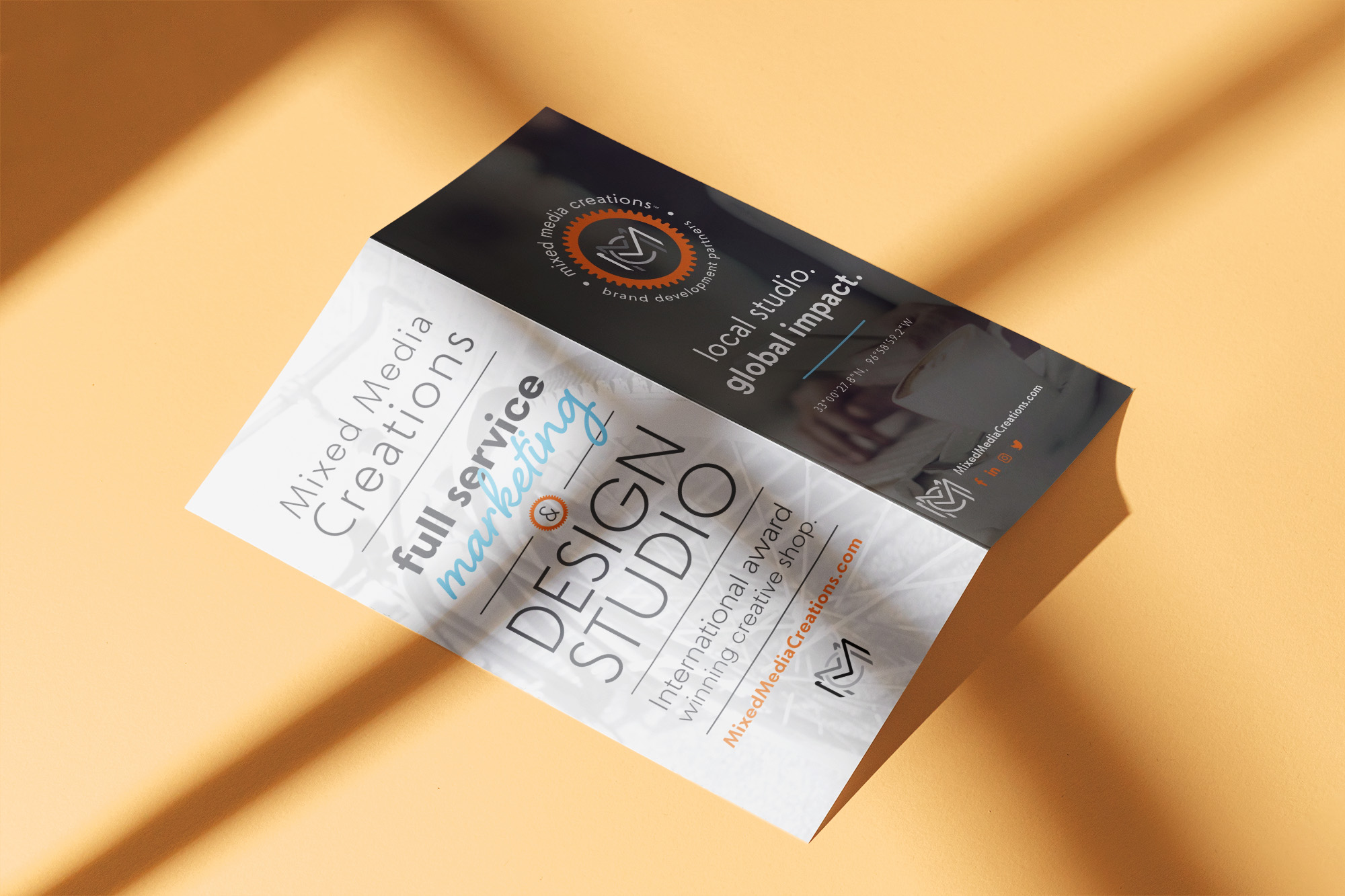
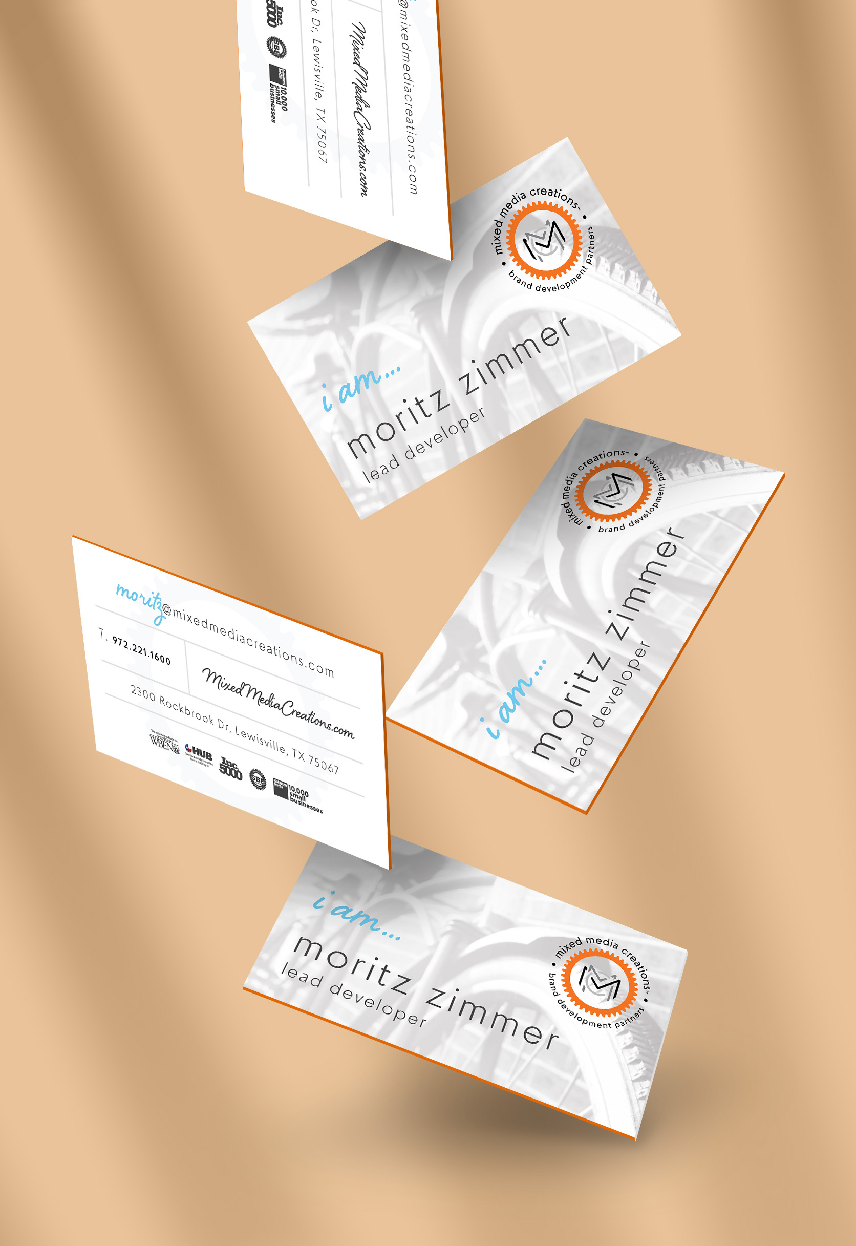
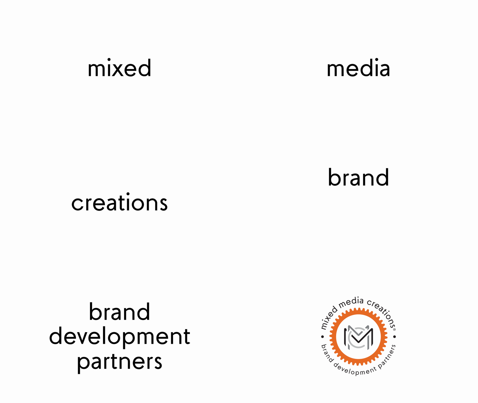
“MixedMedia” is a custom font family designed to help create a new brand identity for Mixed Media Creations, a Dallas-based creative agency. When the company underwent a complete brand refresh for its 10th anniversary, I designed its new brand typeface.
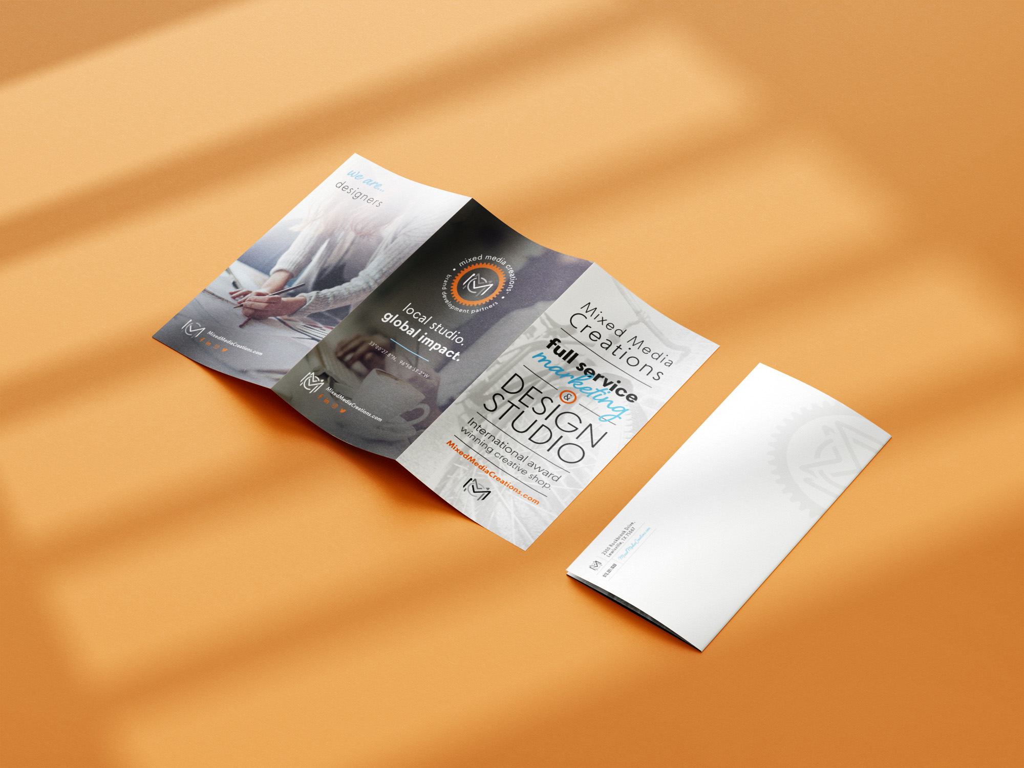
Signaling a new era, the new branding sought to maintain the agency’s existing voice, style, and recognition with bold colors and playful composition. The MixedMedia font family now anchors the company’s visual presence throughout all print, digital, and environmental materials.
About_
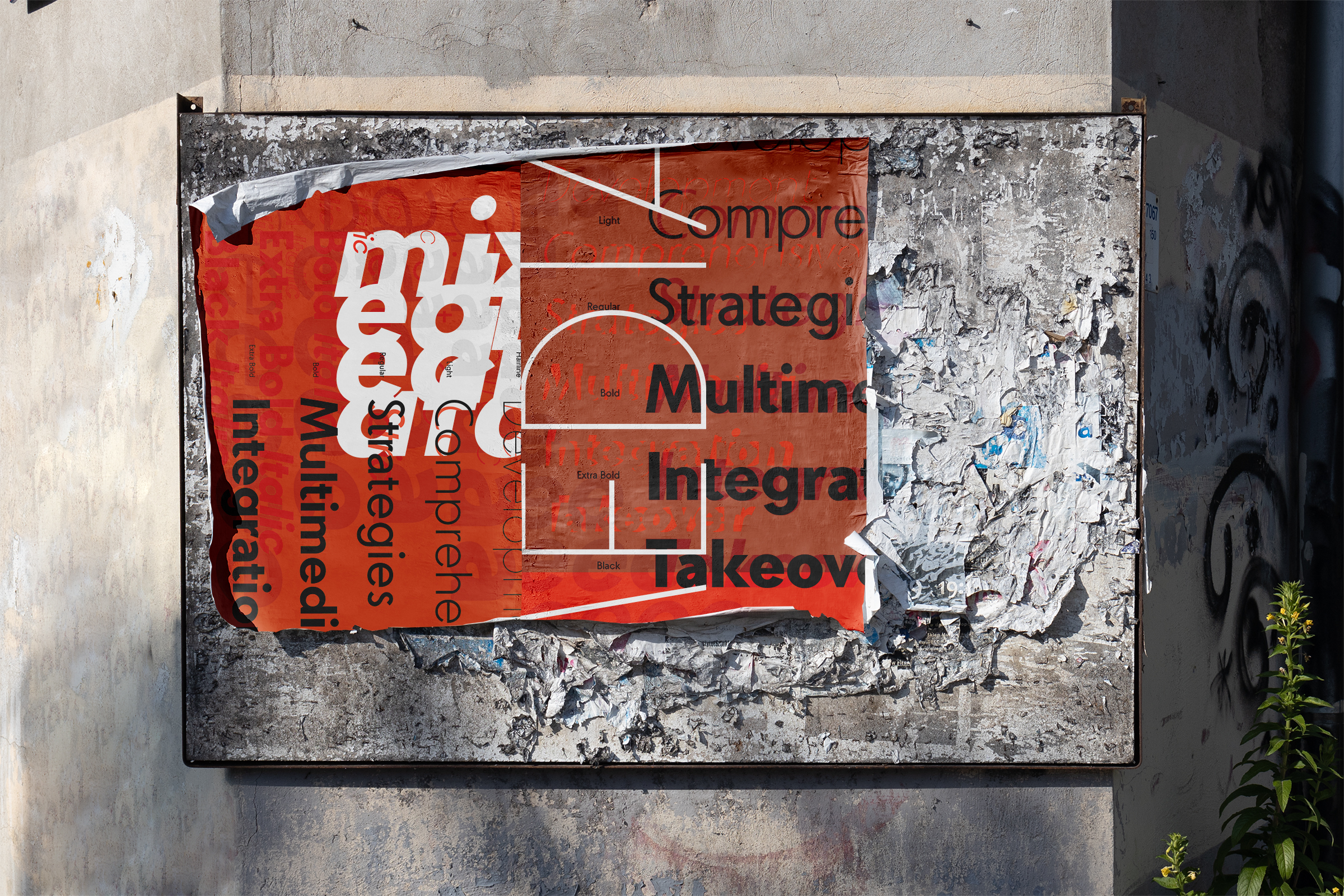
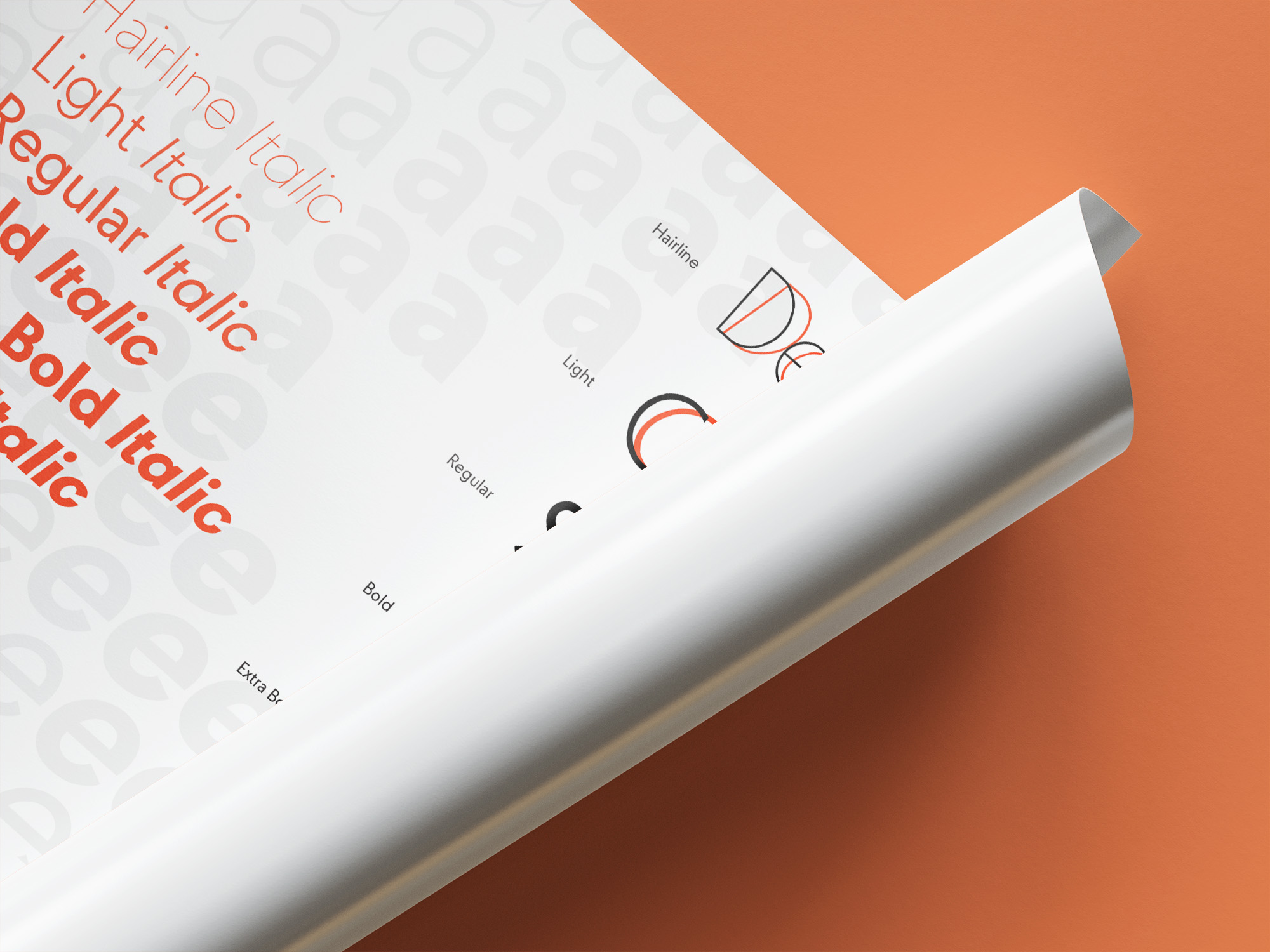
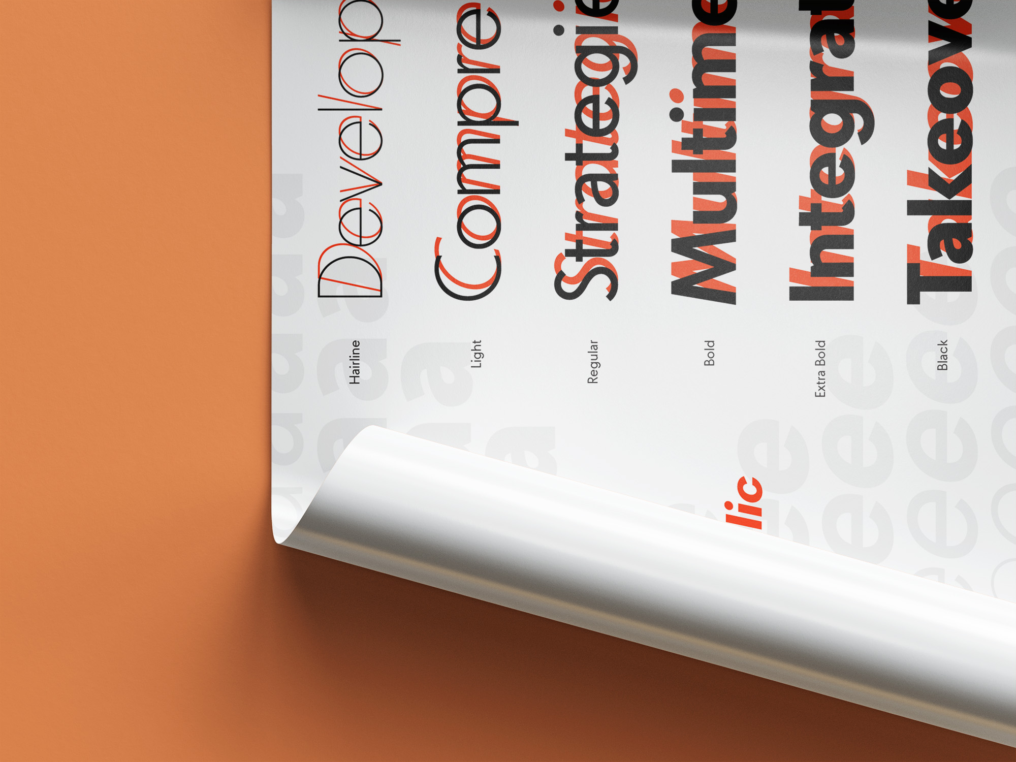
MixedMedia is a comprehensive Open Type family with 48 styles across 6 weights, 2 styles, with display and text variants. True to its name, MixedMedia is at home in more than one traditional category: A humanist-derived and geometric sans, informed by much of the company’s past visual material, while taking it in distinct new directions.
Typeface evolution_
In order to look cohesive with the most recent pre-redesign material, the new type had to look good and unique across different weights and styles, while tying back to the old.
Over the years, the company had used a variety of different sans serif typefaces across its collateral and branding, and one of the goals was to unify the differing and evolving ideas into a single type.
MixedMedia was designed to evoke continuity to previously used geometric sans like Luxury Gold or Neutraface in headlines, and humanist sans like Lato or ITC Avant Garde for copy text.
In much of its old branding material, the company had used thin all-uppercase headlines. The new direction for the brand leaned heavily into bold lowercase lettering for headlines, and generally thinner body text.
The geometric-derived uppercase letters run fairly narrow in all non-circular shapes, which matches the width of most of the lowercase letters. The lowercase letters, on the other hand, are fairly rounded, featuring diagonally cut-off horizontal stems, which in turn mesh with the circular uppercase letters.

Much of MixedMedia’s charm comes from deliberately and unexpectedly disconnecting related shapes. The lowercase c, for example, terminates horizontally on the lower terminal, but angled on the top. On the lowercase e, the same angle is repeated, but this time on the bottom terminal of the e.
Even more fonts_
MixedMedia is a custom proprietary brand font, it is currently not available for purchase or use, but if you are interested in a custom typeface for your project, contact me!
